Posts

Showing posts from March, 2014

Running... Again?

Image
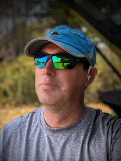
  If you know me you know there was a time about 10 years ago or so where I was running. A lot. At least 5 days a week and at least 5 miles a run. I wasn’t training, I wasn’t preparing for a race or a marathon. I just found myself enjoying the time spent running. I wasn’t obsessed with numbers, but I kept track of them all and liked seeing improvements in time and distances. It was good physical health and mental health. Then I tweaked my knee. Not bad enough that I couldn’t walk on it, just a tweak that told me I needed to back off of running for a little bit. So I decided on 2 weeks. At the end of 2 weeks I aborted a run very early as the pain was still there. 2 weeks became 3, became a month, became 5 years. 

Pano Sunset

Image
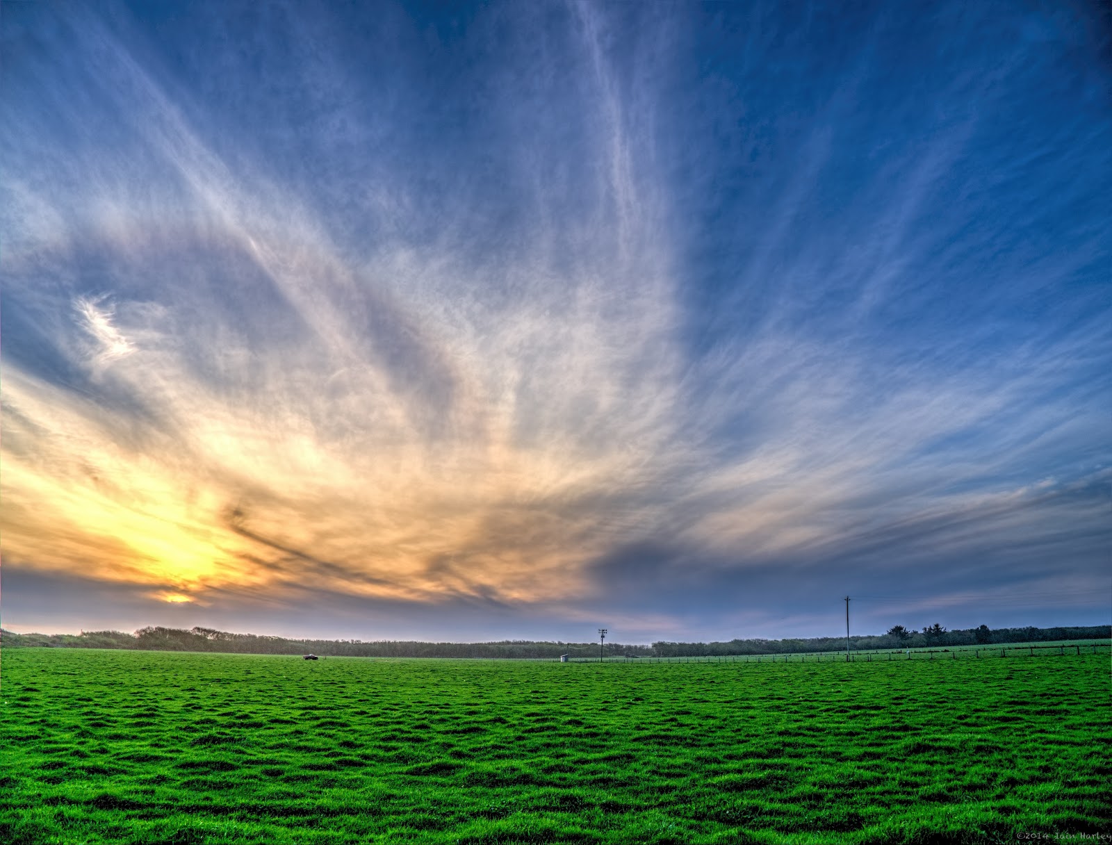
Epic Sunset Stumbled across an album primarily of sunset shots. I remember at the time not wanting to publish them all for fear I run out of things to post, and I shot them about the same time I shot my zen rock (cairns) focus fun shots. I rediscovered them today and ran across some shots I took for a hopeful panorama. There's one thing I've learned about stitching panoramas with Photoshop Elements 11, if you don't like the outcome the first time around just try it again. I don't think I've ever seen PSE spit out identically stitched panoramas. Now I don't know if that's a quirk in the software or an issue with how I shoot my panorama shots, but it has proven to be very helpful at times. This is a 10 shot panorama with the finished dimensions of 9225x3724 and clocks in at roughly 36 megapixels. And this is not an HDR'd shot. I really like, for the most part, how this shot turned out, though it's not without some problems. Processing wise, after

Dilapidated

Image
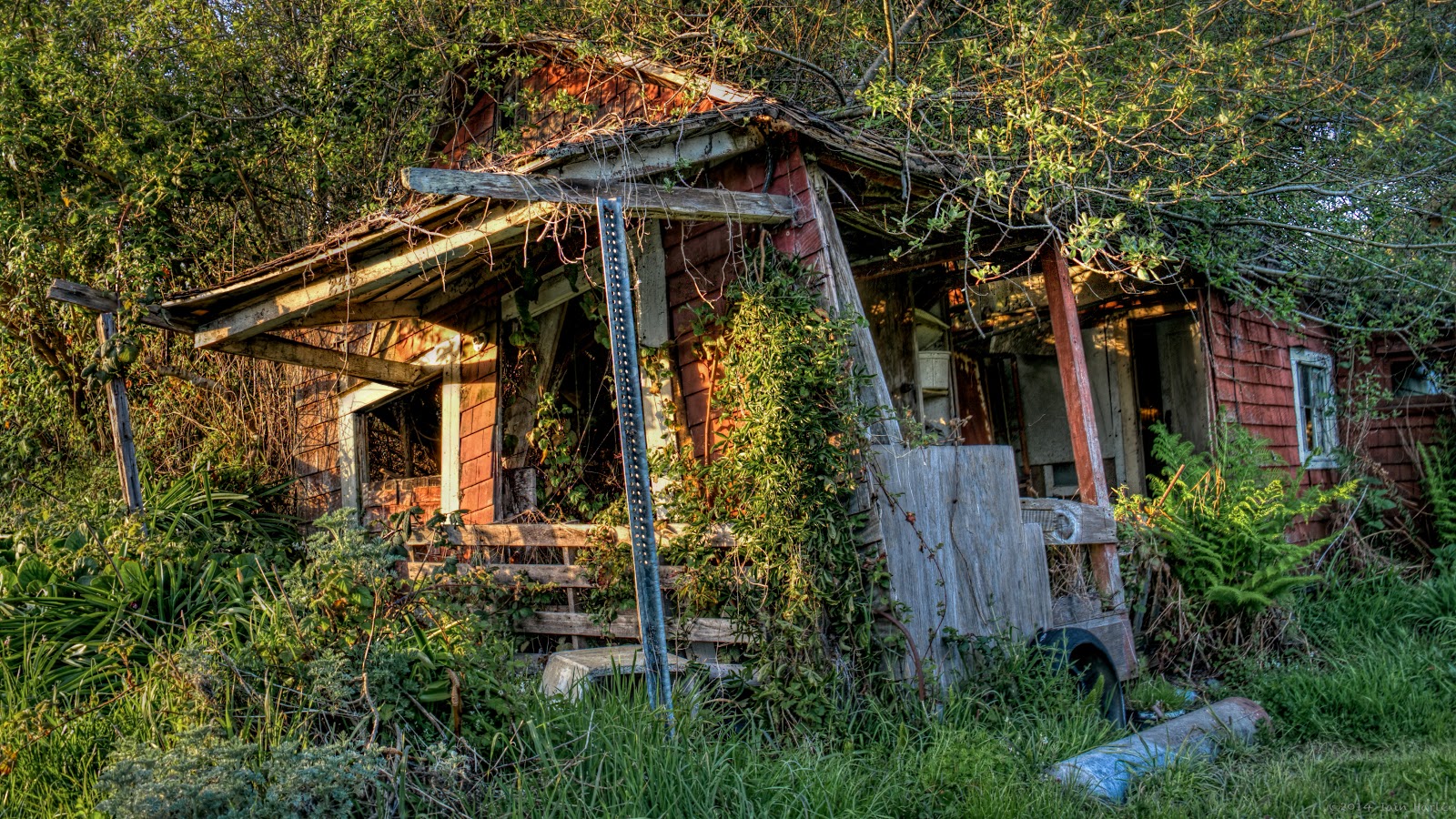
248 For week 12 at  +The Patch - PhotogrAphy Themed CHallenge  our theme was Dilapidated structures. While out hunting for some I came across 248 (the address number). I only stopped to shoot this because of the glorious light during golden hour. Though it completely fits the theme. 248 Front  From this angle you can see the brush slowly enveloping it. I wonder if I'd be able to find it again in five years or so. The 248 Neighborhood As you can see 248 isn't alone.

Something A Little Different

Image
What a Sky! I took the brackets that made this shot while searching for bridges earlier in the month. I saw this crazy sky and not having much time I just rattled off a couple sets of brackets not quite sure what I was going to do with them. I didn't know if I'd do an HDR or a simple blending of two exposures, but I was hoping I'd get something. I wish I had a wider lens or had taken the time to unpack the tripod. Oh well. Processing wise I immediately went to these brackets as opposed to the bridge shots I had taken for a deadline on  +The Patch - PhotogrAphy Themed CHallenge  but my mindset wasn't mixing with what I wanted to do with this photo. This photo is a little much. I tried working with a single exposure. Tried playing with a couple exposures, but the ending photo came out looking flat. So I did what I wanted to do from the beginning and just HDR it. Is it realistic? No, not really. Do I like how it turned out? I do.

Hard Rock

Image
Wave Crash I'm a fan of the  +Plus One Collection  and their yearly collection that is put together every year with proceeds going towards a charity. This year that charity is the Samburur Project , a charity bringing clean water to areas in Kenya. The Photographers For Good  Foundation oversees the project that is primarily spread through the very large photography community on Google Plus. Hundreds if not thousands of photos are submitted every year and the top photos of then put together into a book that is for sale. The other photos not selected for the book are shown on the project's website. You can check out the current submissions here .

Churches on The Patch

Image
Holy Trinity Church in Infrared Of the three months of themes for  +The Patch - PhotogrAphy Themed CHallenge  it is obvious to me which one has been my favorite so far. The month of March has 5 different architecture categories, and this past week was Churches, and when it came to choosing a photo I found that I had quite a number of shots to choose from with different processing for each. The above shot of Holy Trinity Church, established in 1863 in Trinidad, CA, is the shot I chose to show. This is an infrared shot that gives it, in my eye, a different feel, a subtle glow to it.

The (Covered) Bridges of Humboldt County

Image
Brookwood Covered Bridge Our theme for  +The Patch - PhotogrAphy Themed CHallenge  this week was Bridges. I had a couple in mind at the beginning of the week, but these were bridges I had already shot before and I was struggling with how I'd shoot them in a fresh light. I shot some and thought I was done. When I got them into Aperture and started working on them I wasn't exactly thrilled with them. They met the themes, sure, but they looked like retreads, or worse, exact copies, of shots I had already done. Actually because of the weather recently these shots were worse than the original shots I had done. Basically I would have rather submitted 2 year old photos over these. So I asked Google if there were any covered bridges nearby. Oddly Sure enough there were three, but time and weather limited me to only getting to one of them in time for the project's deadline. Built in 1969 the Brookwood Covered Bridge is the longest of the three bridges at 66 feet and crosses J

Building Features

Image
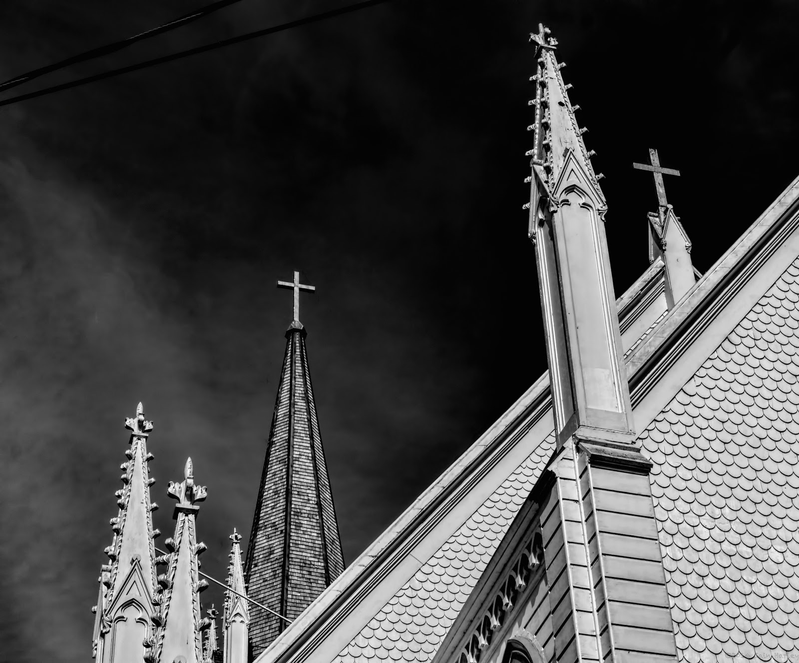
Aspiring Spires For week 9 of  +The Patch - PhotogrAphy Themed CHallenge  our dual themes are Architecture for the month of March and for week 9 Building Features. I came across this church and really liked the taller spire or steeple. It looked like it had just been recently re-shingled. There were two things about this shot that I felt needed to be handled well, the detail in the circular shingles on the outer walls, and the look and feel of the re-shingled spire. That meant having a smaller aperture than I would have normally shot, and taking some time in post processing to make sure things were nice and sharp. The photo was pretty sharp to begin with, but  +Topaz Labs InFocus  lets me sharpen things up a little more. Then I used Clarity  to really target contrast in the shingles. Then I used Black & White Effects to do the conversion. I ended up having to tone down the white of the church as it was overwhelming the detail in the walls, and honestly, was quite blinding. Th

Popular posts from this blog

Running... Again?

The Pros and (Mostly) Cons of Upgrading to a 4K Monitor